They say not to judge a book by its cover, so the same would hold for purchasing music, right? However, the Grammys recognize there is admirable skill and creativity required to channel the vibe of an album via its artwork. Presented to the art director, not the performer (unless they are also the art director), this ultimate industry appreciation for visual aesthetics dates back to to 1959.
Originally categorized as “Best Album Cover,” the prize was split into classical and nonclassical divisions from 1962-1965. 1966-1968 saw separate awards for both graphic arts and photography. The Grammy then became known as “Best Album Package” in 1974, changing again in 1994 to “Best Recording Package” as music formats varied. The next year, box sets were split into its own “Best Boxed or Special Limited Edition” category. Though the specifics may have changed, the memorable impact of an album’s presentation can brings as much joy and reminiscing as the music contained within. Of all the winners over the years, here are our all-time favorites and the story of how they came to be.

The Beatles: Sgt. Pepper’s Lonely Hearts Club Band
Conceived by art directors Jann Haworth and her husband Peter Blake, Sgt. Pepper’s Lonely Hearts Club Band was one of the most expensive covers ever created. The initial idea came from Paul McCartney and the band gave their recommendations for which famous figures would accompany them in the shot by photographer Michael Cooper. The celebrities were crafted from cardboard into a collage that took eight days to create with the goal of making it appear they had all just enjoyed a concert with The Beatles in a park. “Letters had to go out to get permission from everybody, and some people did turn us down,” said George Harrison. One such example was Mae West, who was ultimately convinced after receiving correspondence from all four bandmates to sway her decision. Adorning the neon uniforms of McCartney and Harrison are their MBE medals, while John Lennon borrowed his accoutrement from former Beatle Pete Best’s mother. The effort paid off with a Grammy for Best Album Cover, Graphic Arts in 1967.

Pollution: Pollution
There’s something about an innocent baby chick wearing a miniature gas mask that sums up the worldview of 1971, plus ties in with the band’s name appropriately. Art director Gene O. Torrence was previously known for his music career as half of the surf music duo Jan & Dean. When his partner Jan Berry was injured seriously in an automobile accident and they could no longer continue making music, Torrence tapped his previous college education in graphic arts to form Kittyhawk Graphics. No chickens were harmed in the making of the shot, even though the back cover makes it appear the chick met its demise. Photographer Gene Brownell returned the chicken to the Los Angeles County Museum of Science & Industry in good health after the photo session. The pair earned the 1971 Best Album Cover Grammy.
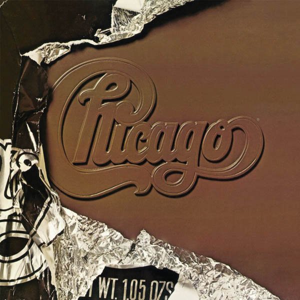
Chicago: Chicago X
Upon first glance, one wants to peel away the foil candy bar wrapper and expose the complete Chicago-embossed chocolate underneath. The depth and detail of the design gives the whole image a 3D effect. Art director John Berg was no stranger to album design. Though he had never worked on art for records prior to joining Columbia Records in 1961, he ended up working on over 5,000 of them during his 25-year career at the label. For the Chicago X album, he employed a gatefold design that expands the album art and reveals even more of the faux chocolate bar’s outer dimensional wrapping and the Chicago logo. The creativity earned Berg the 1976 Grammy for Best Album Package.

The Rolling Stones: Tattoo You
Peter Corriston already made waves as art director for the Stones’ two previous album covers for Some Girls (1978) and Emotional Rescue (1980), so he was an easy pick for 1981’s Tattoo You. Hubert Kretzschmar photographed Mick Jagger and Christian Piper meticulously illustrated the tattoos on the singer’s face. Guitarist Keith Richards also got some faux ink for the back of the cover. The collaborative effort earned Corriston’s concept the Best Album Package Grammy in 1981.

Cyndi Lauper: She’s So Unusual
Famed photographer Annie Leibovitz shot the budding pop star at Coney Island in front of shuttered The World in Wax Musee, of which the sign was airbrushed out. The primary color vibrancy is punctuated by distressed walls requested by Lauper and scouted by designer Jann Perr. The blue walls contrast with the red of Lauper’s dress procured at her former employer, the vintage clothing shop Screaming Mimi’s. Lauper’s personality was captured dancing with her shoes off thanks to a boom box brought along to the shoot. Her costume jewelry is complemented by a bouquet of flowers purchased on the boardwalk from a vendor. The resulting image earned Perr the Grammy for Best Album Package in 1984.

David Bowie: Sound + Vision
This 1989 retrospective from the late David Bowie may have been for CDs, but it packed an LP-sized punch on design. As the 1989 Grammy winner for Best Album Package, the outer case consisted of a plastic overlay with a semi-transparent pastel lavender photo of Bowie by photographer Greg Gorman screened on it. The additional cases for the three CDs and one CD-Video are visible beneath the image, including one that lines up with Bowie’s face for a surreal effect. The other three discs celebrate Bowie at various stages in his career with elements of the overlayed main image also in the background. A corner sleeve covers about ¼ of the album at an angle with the same main image lining up, but in a sepia tone and slides off. Designed by Roger Gorman, the box set was so well received that Rolling Stone declared it “stood above the rest” of the year’s other releases. The original edition was also available as six LPs, three cassettes and even 350 limited edition solid beach wood cases with a certificate autographed by Bowie.

Various: Ultra-Lounge (Leopard Skin Sampler)
Who cares which artists are on this album, collectors nerd out on the design. Synthetic faux leopard fur that you instantly need to reach out and touch adorns the cover, punctuated by a plastic blue, orange, green or purple Ultra-Lounge logo. Art directors Tommy Steele and Andy Engel’s vision nabbed them the 1996 Grammy for Best Recording Package for an album that five-time Grammy nominee Engel described as “music for lonely guys with great stereos.” Collaborator Steele was also no stranger to Grammy nominations for album art, with six of his own nods and a penchant for authoring several pop culture graphic design books.

Ani Difranco: Evolve
The physical, tactile nature of album art design was on full display for the 2003 Best Recording Package winner. Along with graphic artist Brain Grunert, Di Franco’s Evolve makes use of die-cutting space for the title and moth amidst the metallic sheen of the ice blue slip-case covering, while her name itself is debossed. The significance of the moth is a reference to the lyrics on the title track: "And there's this moth outside my kitchen door / She's bonkers for that bare bulb/ Flying round in circles / Bashing in her exoskull / And out in the woods she navigates fine by the moon / But get her around a light bulb and she's doomed/ She is trying to evolve."

Tool: 10,000 Days
Cracking the CD shrink-wrap on 10,000 Days packed as much anticipation and excitement as a Ralphie on Christmas morning getting a Red Ryder BB gun. Though it’s difficult to tell from a mere picture of the album, the overall experience is meticulously crafted and interactive. The visionary artwork of Alex Grey for his Tool collaborations were influenced by spiritual journeys from consuming ayahuasca and the subsequent DMT trip. In an interview with the Examiner, Grey stated that the 2006 winner for Best Recording Package’s cover is "a blazing vision of an infinite grid of Godheads." The cardboard-bound CD booklet designed by Art Director Adam Jones comes complete with a pair of stereoscopic glasses for viewing the album’s images and 3D experience.

Radiohead: In Rainbows
Artist Stanley Donwood has collaborated with Thom Yorke on album art since 1994. That effort includes Donwood creating the artwork while the band toils away in the studio to best reflect the music in a visual medium. “I try to see what the music looks like,” Donwood told DIY. He experimented with a photographic etching technique and putting prints into acid baths, using hypodermic needles to squirt ink on a piece and he also incorporated molten wax after a happy accident of spilling it on his work. The result brings to mind NASA celestial images and a dirty rainbow effect much like oil in a puddle for this offering from he and art directors Xiaan Munro and Mel Maxwell. To understand the typographical significance of the 2008 winner for Best Boxed or Special Limited Edition Package, one must look for patterns in not just this album, but previous Radiohead offerings. The number 10 is prevalent in not only the release date (10/10/2007) but hidden in the band’s name on the cover, as well as conspiracies related to 10 as in it was 10 years after OK Computer and that the 10 tracks can be synchronized, though the band has never confirmed this.
Deanna Rilling is a freelance journalist based in Las Vegas, NV. She's been involved in the music scene for over 20 years and turned that love of music into a career in 2007. A rocker/raver, her vinyl collection is an amalgamation of anything from Tom Petty, David Bowie and Prince to the Crystal Method, DJ Shadow and Pretty Lights, with some Tori Amos and Aaliyah thrown in for good measure.
Related Articles
Join the Club!
Join Now, Starting at $44Exclusive 15% Off for Teachers, Students, Military members, Healthcare professionals & First Responders - Get Verified!
